UK colour design
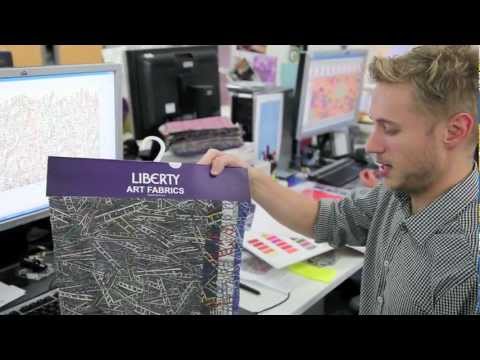
Meet Emma Mawston, our Head Designer at Liberty Art Fabrics as she talks us through each design group in the new SS12 collection. Find out the inspiration behind each one, plus meet the Liberty Design Team as they share their favourite print from the collection with us.
The Spring Summer 2012 Liberty Art Fabrics collection was inspired by archives, antiques and costume. Colour palettes were based around mood boards created by eminent contributors to fashion, art and antiques, with prints giving a nod to the beautiful Glencot House in Somerset as well as Olympic motifs.
More on Liberty London HERE
Their Liberty of London AW12 fabric collection is now in store, each print telling a different story.
This season the collection celebrates the innovation of the textile process through an exploration of the broad spectrum of textile techniques. The prints are inspired by historical and current textile design including block printing, weave, embroidery and needlepoint, as well as the latest digital printing techniques.
Go behind the scenes and meet the designers who created the prints in our in house studio – you’ll discover the secrets of what inspired their favourite print and how their original art work has transformed into designs now available to buy in store.
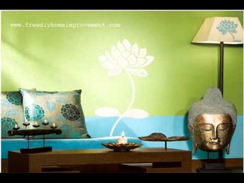
Some simple but very effective colour scheme ideas in how to choose and match contrasting paint ideas in this video. When painting the interior walls of your home, remember that darker shades need additional coats for a professional look. The actual shade or the color, mainly darker shades, can only truly be seen after the paint is dry, so allow enough time between each coat to ensure the right colour match.
There is no sound with this video, but it might spark some great ideas for those on a tight budget or want a simple makeover ideas.
A great video by Laurence Llewelyn-Bowen on using colour in your home and the design rules to make it a success, filmed by the BBC the video gives some great tips and advice on how to make the bets of your bedrooms and living areas.
Laurence refers to the use of colour in home decor as more than half of Britain’s top 10 colours are variations on cream and, much to Laurence’s disgust, magnolia is at No 1. His task in Design Rules is to transform a north-facing family dining room in a Victorian house which has fallen on “decorating hard times.”
Laurence is tempted by purple, which, despite being his trademark, has only been painted on walls by the designer four times over his television career. But Laurence also wants a wrap-around colour palette to really bring the room to life.
One thing that comes out is we in the UK need to be more bold and adventurous in the way we use colour and the effects of light as it hits the various shades.
Hope you enjoy and gives you some great Interior design tips.
Practical tips and advice on how to choose colors, textures and decorating styles for small to big projects in your home. Plus a section on heights, measurements & other interior decorating tips to save time and money. Shows you how to play with fabric colours, your furniture, flooring and things you need to consider when wanting to redesign your home. How to focus when selecting home accessories to complement your wall finishes, choosing cushions, throws etc. This video covers American sized rooms.


